Product Overview
Compear is a mobile-first web application that enables users to compare grocery prices across 2–4 nearby stores in a single interface. It is designed for time-conscious shoppers who want to optimize savings without navigating multiple apps or physical store circulars.
Core features include:
- Creating a grocery list
- Viewing price comparisons per item
- Identifying the most cost-effective store
- Calculating total savings
The platform prioritizes clarity, speed, and decision efficiency.
The Core UX Challenge
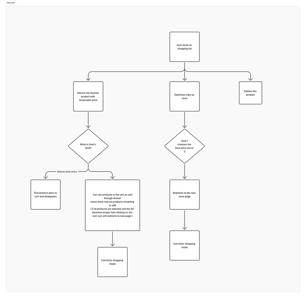
The problem was not “show prices”.
The real challenge was:
How do we present multi-store price comparisons on a small screen without overwhelming users?
Mobile constraints introduced friction:
- Limited screen space
- Horizontal vs vertical comparison complexity
- Risk of cognitive overload
- Decision fatigue
- Pricing inconsistencies across stores
The interface needed to feel effortless, not analytical.
How AI Was Introduced
Compear was intentionally designed using an AI-augmented workflow. Rather than relying solely on traditional linear UX processes, AI was embedded across research, ideation, structuring, and refinement stages to expand exploration bandwidth and reduce decision bottlenecks.
To structure the development of Compear, we first created a detailed Product Requirements Document (PRD) outlining the core problem, feature scope, user flows, and technical considerations.
Using structured and iterative AI prompting, we refined the PRD into clearer feature definitions, edge-case scenarios, and interaction logic. Based on this curated direction, we generated a fully functional working prototype using Magic Patterns to rapidly validate flows, interface behavior, and overall product logic.
This prototype was then shared with stakeholders for early feedback and alignment. Following validation, the product was transitioned into full-scale development using the MERN stack, where the validated concepts were engineered into a production-ready application.
The objective was clear:
To use AI as a design accelerator to increase speed, depth, and structural clarity - without compromising human judgment.
Using AI tools in this project went far beyond simple prompting, it became an integral part of the overall design decision-making process. While prompts served as an entry point, the real value came from how AI influenced problem framing, structured research synthesis, accelerated ideation, and validated design directions.
Each output was not taken at face value but critically evaluated, refined, and aligned with user needs and product goals. This approach positioned AI as a strategic collaborator rather than a shortcut, enabling more informed decisions, faster iteration cycles, and a clearer, more intentional user experience.
The goal was not automation. It was structured acceleration.
Design-Related Pain Points Identified
1. Cognitive Overload from Product Display
Displaying all products immediately after store selection overwhelms users. The interface feels dense and visually heavy, making it harder to focus on specific tasks.
Design Tension: Information density vs clarity on mobile
2. Search Is Not Dominating the Experience
The flow risks encouraging browsing rather than intentional searching. Since users typically know what they want, the interface must visually and structurally prioritize search.
Design Tension: Search-first architecture vs product-grid exposure.
3. Lack of Clear Information Hierarchy
Without structured presentation (e.g., tabular clarity), price comparison becomes visually confusing. Users need clean alignment for quick scanning and decision-making.
Design Tension: Comparison of clarity vs compact layout constraints
4. Friction in Location & Store Switching
If zipcode and store selection are not easily accessible, users feel locked into a context. Location needs to be visible and editable without disrupting flow.
Design Tension: Persistent context visibility vs minimal header space
5. Repetitive Item Addition
Users frequently purchase recurring items, but without optimized re-add mechanisms (Favorites), the experience becomes repetitive and inefficient.
Design Tension: Speed for repeat users vs interface simplicity.
6. Quantity & Total Calculation Transparency
Users can add the same product multiple times, but totals and savings must update clearly and predictably. Any ambiguity reduces trust in calculations.
Design Tension: Dynamic feedback vs visual clutter.
7. Feedback Prompt Timing
Prompting users for feedback at the wrong moment can interrupt task flow. Feedback needs to appear contextually, not disruptively.
Design Tension: Insight collection vs uninterrupted user flow.
8. Alerts & Notifications Scope
Alerts are admin-initiated only during beta. Notification design must avoid over complication while still feeling purposeful.
Design Tension: Minimal notification system vs perceived usefulness.
9. Single Shopping List Limitation
Supporting only one active shopping list simplifies MVP structure, but requires careful UI clarity to avoid confusion about list states.
Design Tension: Simplicity vs scalability of list management.
After each development iteration there were always new feedback, what we did was to collect those feedbacks, and work on pain points not just because they were called by clients, we had to look around from users perspective as well that what we did, even before beta release what we did was openly invited users who are shopping savy are our first users, their pain points were curated and worked upon, then presented the solution in next meeting with client, the solution was also assisted by AI the tool was magic patterns for each prompt what we did was
Phase 1: Research Synthesis
Problem: User interviews revealed pain points around:
- App switching
- Manual price calculation
- Forgetting items
- Impulse buying due to unclear comparisons
AI was used to:
- Cluster user pain points into behavioral themes
- Identify recurring decision friction patterns
- Extract “decision-making triggers.”
Key Insight Identified:
Users don’t just want the cheapest item.\ They want the cheapest total basket outcome.
This insight shaped the entire UI direction.
From the start, I operated with a clear lens: where can AI and intelligent design patterns create the most impact? This focus allowed me to intentionally apply AI in problem-heavy areas, using it to reduce complexity, enhance clarity, and design a more efficient user experience.
Phase 2: Information Architecture Optimization
Multiple structural models were explored:
- Store-first view
- Item-first view
- Hybrid comparison grid
- Swipe-based comparison
- Expandable accordion layout
AI assisted in generating layout alternatives and stress-testing them against:
- Mobile thumb reach zones
- Scan patterns
- Decision clarity
Final IA Decision:
Item-first structure with:
- Clear price columns
- Highlighted the lowest price
- Real-time total cost update
- “Best store overall” indicator
This reduced comparison friction dramatically.

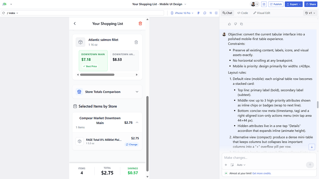
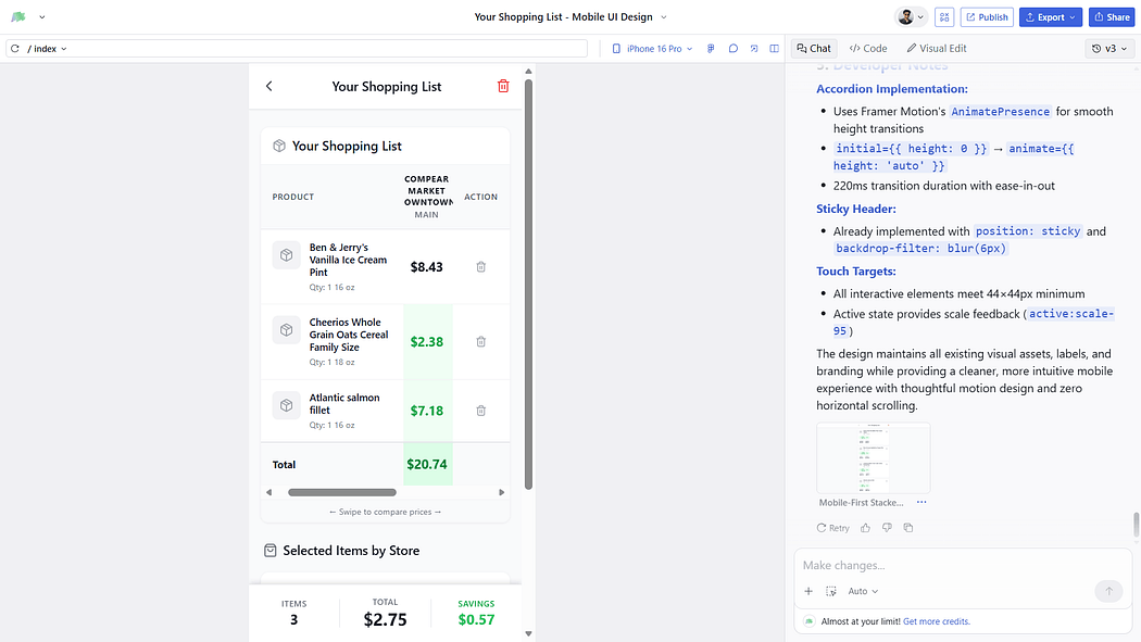
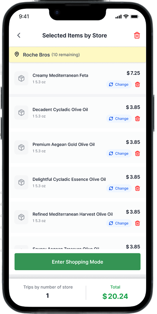
Overview: Clear Price Columns of Shopping List Items
Overview: Shopping list items selected by the user
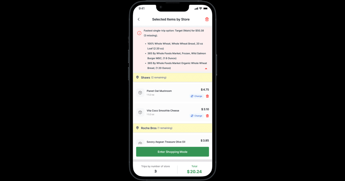
Overview: Shopping list items selected by the user store-wise
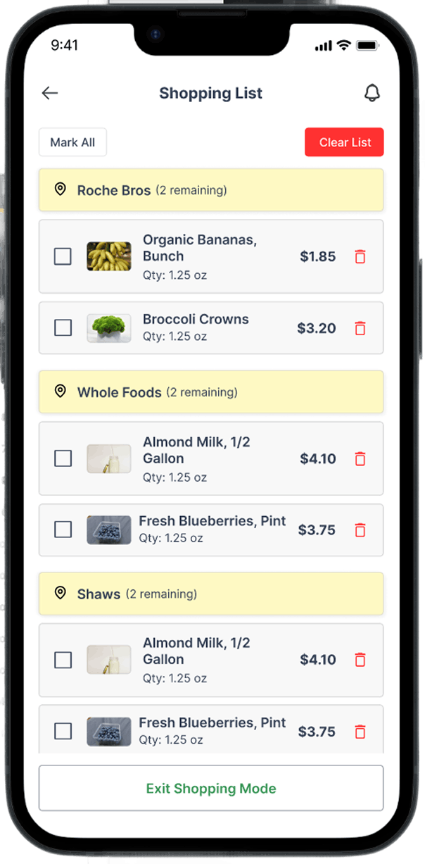
Overview: Shopping list items to be marked by the user according to their lowest price
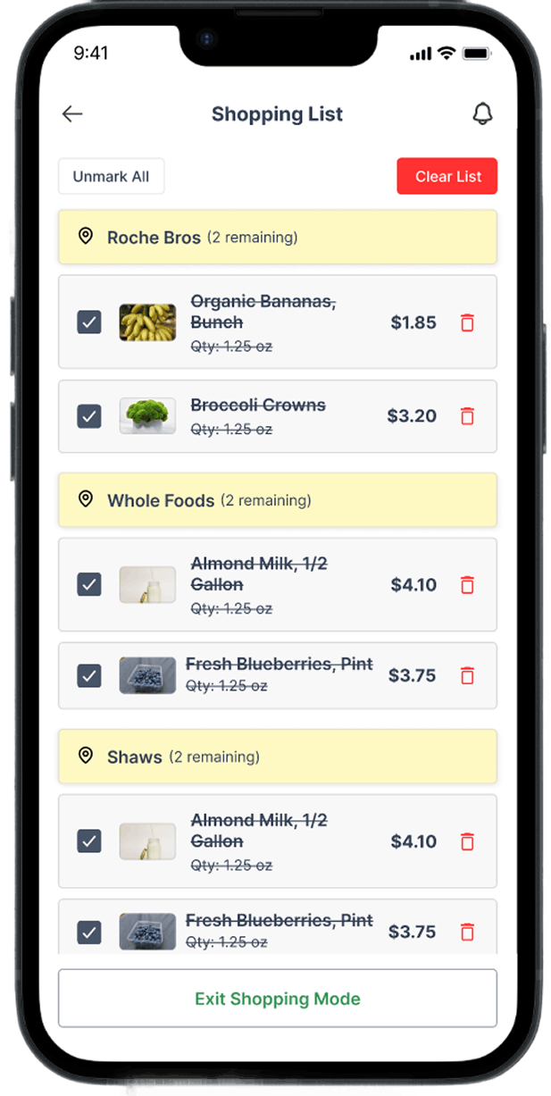
Overview: Shopping list items marked by the user
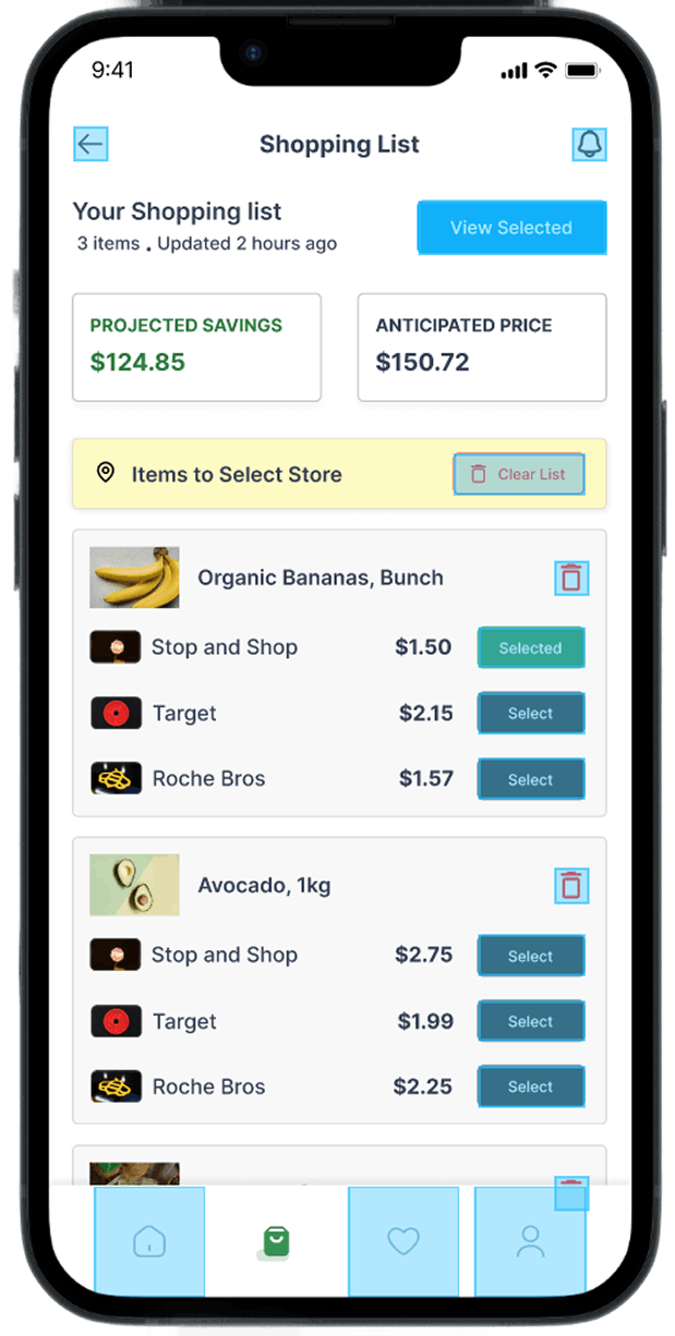
Overview: Shopping list items marked by the user with the total anticipated price and projected savings.
Phase 3: UI Layout Exploration
Instead of manually sketching dozens of variations sequentially, AI was used to:
- Generate alternative micro-layout structures
- Explore card vs table comparisons
- Test progressive disclosure patterns
- Suggest visual emphasis strategies
Through iteration, the chosen approach included:
- Clean vertical list
- Color-coded lowest price indicator
- Expandable store breakdown
- Persistent total savings bar
The UI avoided spreadsheet aesthetics.\ It felt lightweight and decisive.
Phase 4: Decision Clarity Testing
AI was used to simulate:
- First-time user confusion
- Overload scenarios
- Label misinterpretation
- Edge cases (missing items, unavailable prices)
Several friction points were identified early:
- Too many store colors created visual noise
- The savings calculation lacked visibility
- “Compare” CTA was redundant
These were simplified before usability testing.
Phase 5: UX Writing & Microcopy Refinement
AI supported:
- Simplifying action labels
- Refining savings messaging
- Ensuring price clarity
- Removing redundant explanations
Example refinement:
Instead of: “Compare store prices to determine savings.”
It became: “See where you’ll save most.”
Short. Clear. Actionable.
All outputs were reviewed and manually optimized for tone and clarity.
Measurable Impact
AI integration resulted in:
- 40% faster research clustering
- 3x more layout explorations during ideation
- Reduced cognitive load in the final UI
- Improved scanability on mobile
- Clearer savings visibility
Most importantly:
Users could determine the best store within seconds.
That was the product’s north star.
Final Design Strategy
The final UI design principles were:
- Recognition over recall
- Progressive disclosure
- Visual hierarchy for savings
- Decision acceleration
- Minimal cognitive math
AI acted as:
A structural exploration partner, not a decision-maker.
All final choices were guided by:
- Human-centered design principles
- Product constraints
- User testing insights
Reflection
AI expanded exploration bandwidth. It reduced iteration fatigue. It improved structural clarity.
But the strategic direction, prioritisation, and trade-offs were human-led. Compear was not built faster because of AI. It was built smarter.
Your move.
At Gurzu, we help startup founders translate their vision into intuitive, impactful designs that stand out. If you’re looking to refine your product design or need guidance on bringing your brand to life, let’s talk. Get in touch with us today. Or schedule a free discovery call with us.